Building Engagement & Leads with Top Up & Tagihan Feature in Moxa
Bringing Users Back with Everyday Services for Consistent Lead Generation
Role
UI/UX Designer
Industry
Financial Services


At a Glance
To address low daily engagement and drive lead generation in Moxa, a financial aggregator app, we introduced Top Up & Tagihan, a high-frequency transactional feature for everyday needs like mobile top-ups and bill payments. This addition encouraged regular user engagement and led to more users exploring Moxa’s core financial products, enhancing lead conversion. Initiated by the business development team, my role as the UI/UX Designer was to craft a user-centered, seamless experience that aligned with Moxa’s business goals and brand identity.
The Result: We achieved a 21% increase in valid leads from 2022 to 2023, followed by a 45% increase from 2023 to 2024. We also saw an uplift in engagement as users came back to the app for their routine transactions.
The Challenge
The Lead Generation Dilemma
Moxa’s core products, like auto loans and personal credit, are crucial but not everyday needs. These products naturally lead to infrequent app visits, making consistent lead generation a challenge. We needed a way to bring users back regularly, allowing us to nurture leads in a more continuous, organic way. That’s when we landed on the idea for Top Up & Tagihan, a transactional feature designed for frequent, daily interactions.
Bringing Everyday Utility to Moxa
The solution was clear: integrate a service that fits into users’ everyday lives. By offering bill payments and mobile top-ups, we could keep users engaged with the app more frequently. And with users regularly interacting with Moxa for routine transactions, we’d be in a better position to nurture them towards exploring our larger financial offerings.
Process
Role & Collaboration
As the UI/UX Designer, I was responsible for crafting an intuitive, user-centered design for Top Up & Tagihan in close collaboration with a diverse team. My primary focus was to ensure the user experience was seamless and met our lead-generation goals. Working with our Product Owner (who helped define project requirements), UX Researchers (who validated our decisions with user insights), Market Researchers from the Business Development team (who identified the high-demand features), and UX Writers (who crafted clear, friendly microcopy), we brought this feature to life.
Identifying the Right Product Fit
The initial idea for Top Up & Tagihan came from our Business Development team. Through their research, they discovered that services like mobile top-ups, electricity bills, and internet payments were highly relevant for our target demographic. These would be the ideal categories to start with for our MVP, balancing user needs and development capacity.

Competitor Analysis
Before diving into design, I conducted a competitor analysis of apps that excelled in bill payments and top-ups. I focused on several key aspects:
User flow: How simple or complex was the process of completing a transaction?
Visual hierarchy: What was the arrangement of information on the screen, and how clear was the call to action?
User engagement: Did the apps offer additional features like transaction summaries or payment history?
Design consistency: How well did the Top Up & Tagihan features align with the rest of the app’s interface?
EThis informed our design choices, helping me create an experience that was both intuitive and competitive.
User Journey Maps
Once the competitor analysis and user research were complete, I created a detailed user journey map. We tracked the process from opening the Moxa app to completing a Top Up & Tagihan transaction, identifying key stages and possible friction points:
Opening the app: Quick access to Top Up & Tagihan services from the home screen.
Selecting a product: Clear categorization of services (mobile credit, electricity, water, etc.).
Transaction details: Easy input of required information (e.g., account numbers, amount to pay).
Payment confirmation: A straightforward and secure payment flow with minimal steps.
Post-transaction: Immediate confirmation and access to payment history.
By addressing each step of the journey, we ensured the user would have a smooth and intuitive experience.

A sneak peek of the user journey for the Top Up & Tagihan feature in Moxa app
Designing the Experience
Once we had a clear user journey, I created digital wireframes to visually represent the core user flow and experiment with different layouts and interactions. With frequent, functional interactions in mind, I kept the layout straightforward, allowing users to complete transactions quickly. With the help of our UX Writer, we crafted friendly and clear microcopy to make the process smooth and approachable.
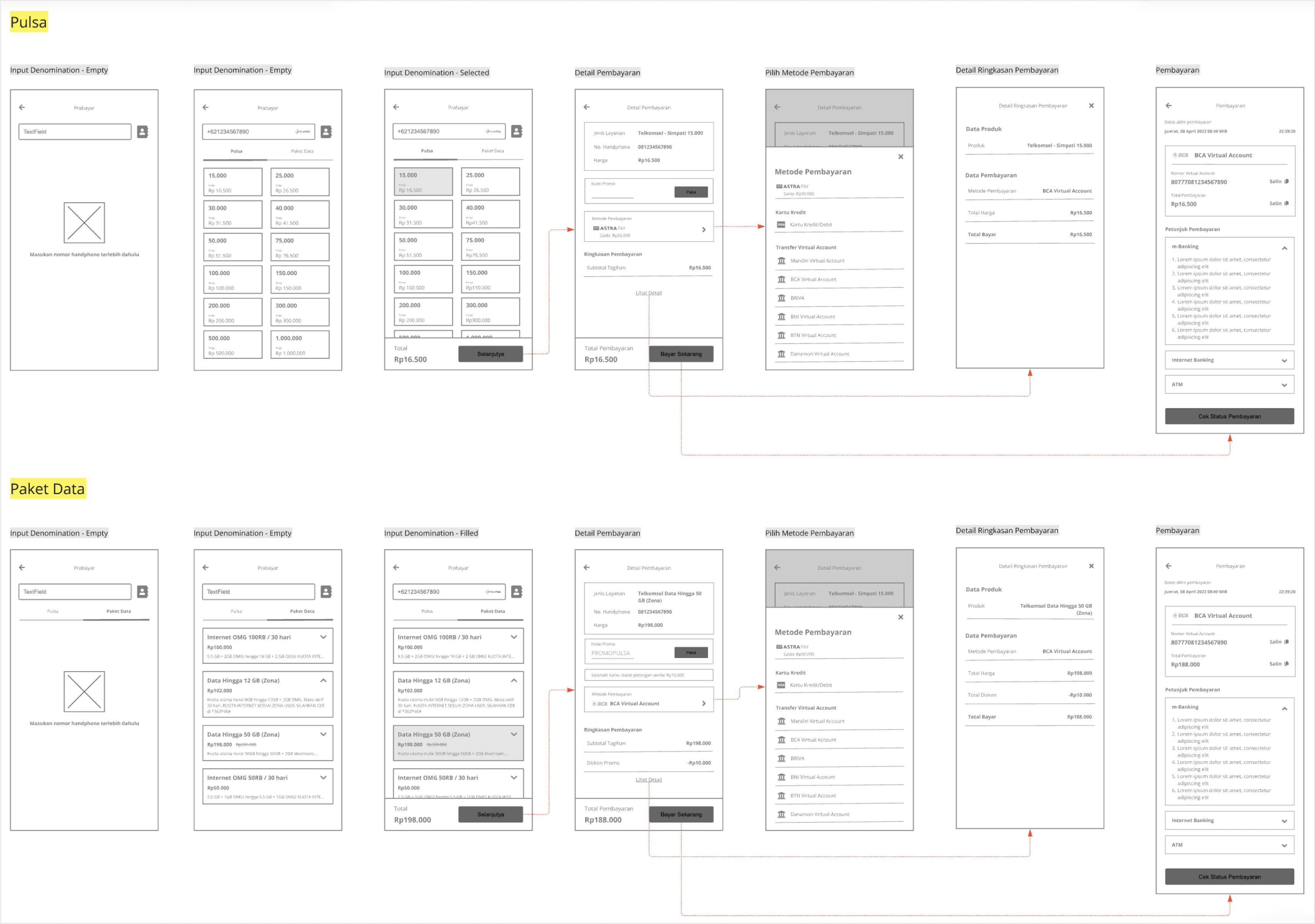
Wireframe example showcasing the user flow for purchasing mobile credit and data packages within the Moxa app.
User Testing
We kicked off user testing after receiving initial insights directly from the directors. Building on their feedback, we designed targeted user tests to see how real users interacted with the feature and identify any pain points. This made sure our testing wasn’t just based on assumptions, but matched real business needs and user expectations.

Design System Integration
To maintain brand consistency, I incorporated the new elements into Moxa’s design system. This ensured that Top Up & Tagihan felt fully integrated within the Moxa ecosystem, rather than a standalone feature.

— A sneak peek of Moxa's Style Guide
Final Design
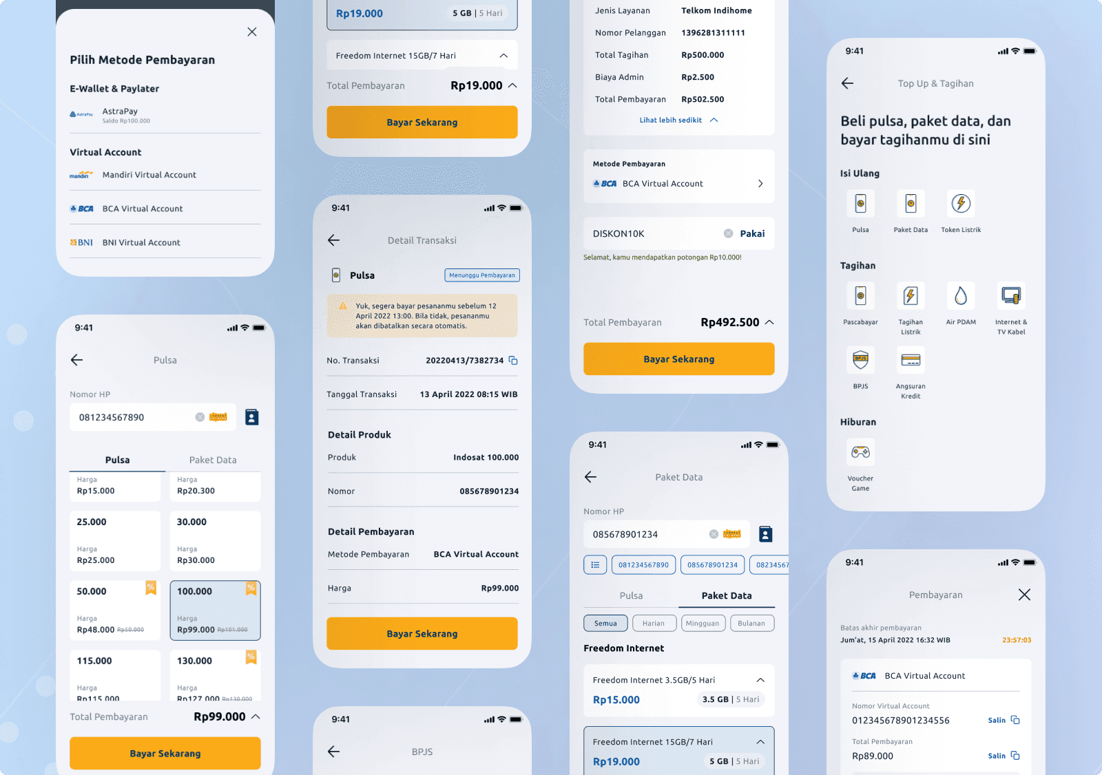
The final product was sleek, intuitive, and aligned with Moxa’s brand. Top Up & Tagihan was built to encourage repeat use, making it easy for users to complete transactions while gently promoting Moxa’s larger services.
Entry Point from Homepage

Checkout & Transaction

Others

At a Glance
To address low daily engagement and drive lead generation in Moxa, a financial aggregator app, we introduced Top Up & Tagihan, a high-frequency transactional feature for everyday needs like mobile top-ups and bill payments. This addition encouraged regular user engagement and led to more users exploring Moxa’s core financial products, enhancing lead conversion. Initiated by the business development team, my role as the UI/UX Designer was to craft a user-centered, seamless experience that aligned with Moxa’s business goals and brand identity.
The Result: We achieved a 21% increase in valid leads from 2022 to 2023, followed by a 45% increase from 2023 to 2024. We also saw an uplift in engagement as users came back to the app for their routine transactions.
The Challenge
The Lead Generation Dilemma
Moxa’s core products, like auto loans and personal credit, are crucial but not everyday needs. These products naturally lead to infrequent app visits, making consistent lead generation a challenge. We needed a way to bring users back regularly, allowing us to nurture leads in a more continuous, organic way. That’s when we landed on the idea for Top Up & Tagihan, a transactional feature designed for frequent, daily interactions.
Bringing Everyday Utility to Moxa
The solution was clear: integrate a service that fits into users’ everyday lives. By offering bill payments and mobile top-ups, we could keep users engaged with the app more frequently. And with users regularly interacting with Moxa for routine transactions, we’d be in a better position to nurture them towards exploring our larger financial offerings.
Process
Role & Collaboration
As the UI/UX Designer, I was responsible for crafting an intuitive, user-centered design for Top Up & Tagihan in close collaboration with a diverse team. My primary focus was to ensure the user experience was seamless and met our lead-generation goals. Working with our Product Owner (who helped define project requirements), UX Researchers (who validated our decisions with user insights), Market Researchers from the Business Development team (who identified the high-demand features), and UX Writers (who crafted clear, friendly microcopy), we brought this feature to life.
Identifying the Right Product Fit
The initial idea for Top Up & Tagihan came from our Business Development team. Through their research, they discovered that services like mobile top-ups, electricity bills, and internet payments were highly relevant for our target demographic. These would be the ideal categories to start with for our MVP, balancing user needs and development capacity.

Competitor Analysis
Before diving into design, I conducted a competitor analysis of apps that excelled in bill payments and top-ups. I focused on several key aspects:
User flow: How simple or complex was the process of completing a transaction?
Visual hierarchy: What was the arrangement of information on the screen, and how clear was the call to action?
User engagement: Did the apps offer additional features like transaction summaries or payment history?
Design consistency: How well did the Top Up & Tagihan features align with the rest of the app’s interface?
EThis informed our design choices, helping me create an experience that was both intuitive and competitive.
User Journey Maps
Once the competitor analysis and user research were complete, I created a detailed user journey map. We tracked the process from opening the Moxa app to completing a Top Up & Tagihan transaction, identifying key stages and possible friction points:
Opening the app: Quick access to Top Up & Tagihan services from the home screen.
Selecting a product: Clear categorization of services (mobile credit, electricity, water, etc.).
Transaction details: Easy input of required information (e.g., account numbers, amount to pay).
Payment confirmation: A straightforward and secure payment flow with minimal steps.
Post-transaction: Immediate confirmation and access to payment history.
By addressing each step of the journey, we ensured the user would have a smooth and intuitive experience.

A sneak peek of the user journey for the Top Up & Tagihan feature in Moxa app
Designing the Experience
Once we had a clear user journey, I created digital wireframes to visually represent the core user flow and experiment with different layouts and interactions. With frequent, functional interactions in mind, I kept the layout straightforward, allowing users to complete transactions quickly. With the help of our UX Writer, we crafted friendly and clear microcopy to make the process smooth and approachable.

Wireframe example showcasing the user flow for purchasing mobile credit and data packages within the Moxa app.
User Testing
We kicked off user testing after receiving initial insights directly from the directors. Building on their feedback, we designed targeted user tests to see how real users interacted with the feature and identify any pain points. This made sure our testing wasn’t just based on assumptions, but matched real business needs and user expectations.

Design System Integration
To maintain brand consistency, I incorporated the new elements into Moxa’s design system. This ensured that Top Up & Tagihan felt fully integrated within the Moxa ecosystem, rather than a standalone feature.

— A sneak peek of Moxa's Style Guide
Final Design
The final product was sleek, intuitive, and aligned with Moxa’s brand. Top Up & Tagihan was built to encourage repeat use, making it easy for users to complete transactions while gently promoting Moxa’s larger services.
Entry Point from Homepage

Checkout & Transaction

Others

Product Successes
Boosted Lead Generation and Engagement
+21% increase in valid leads from 2022 to 2023.
+45% increase in valid leads from 2023 to 2024.
Increased engagement as users returned for routine transactions, driving more consistent use of the app.
What I Learned
This project taught me a lot about the importance of cross-functional collaboration and how critical it is to align business goals with user needs. While the business team provided the initial direction, it was the responsibility of the UI/UX team to make sure the solution was usable, engaging, and fit into Moxa’s overall experience. Additionally, user testing reinforced the value of iterating on feedback to ensure the best possible outcome.
Copyright 2025 by Jasmine Hanifa Mounir
Copyright 2025 by Jasmine Hanifa Mounir
Copyright 2025 by Jasmine Hanifa Mounir